Data Visualisation
Lety Kemp | MSc Health Data Science
Risk rate map - GIS
This page shows some of the methodology of an exploratory data analysis where I used R as a Geographic Information System (GIS) to create risk rates for the region of Swansea, UK.
Adjusted risk rates were calculated and illustrated in a quantile map. The end product was a academic conference poster presented in Data Visualisation, one of the modules of my Master’s Degree.
The data sources were Open Data from UK authorities, but supplied by Richard Fry, a GIS specialist who lecturered us and wrote this great tutorial.
The R code below shows how I joined a few datasets to calculate the probability of accidents resulting in death in the region, essetially, using R as a GIS.
This site was also created using RStudio together with Rmarkdown, GitHub and Latex. The poster was created in Adobe Illustrator. This site was not part of the assignment, however, I loved working with RStudio and just couldn’t get enough of it! ♥♥♥
With no further ado, the GIS code:
#Assign packages needed
pkgs = c('ggplot2', "plyr", "dplyr", "GISTools", "rgdal", "rgeos", "reshape2",
         "DT")

# check installed
new.packages <- pkgs[!(pkgs %in% installed.packages()[, "Package"])]
if (length(new.packages)) install.packages(new.packages)

# load libraries
lapply(pkgs, library, character.only = T)

# Load Spatial Data
bng = "+proj=tmerc +lat_0=49 +lon_0=-2 +k=0.9996012717 +x_0=400000 +y_0=-100000 +ellps=airy +datum=OSGB36 +units=m +no_defs"

# load spatial data - may take some time depending on your laptop
welsh.lsoa <- readOGR(dsn = "wales_lsoa_2011_gen.shp", layer = "wales_lsoa_2011_gen", p4s = bng)
Load road summary to obtain the total road Kilometers in order to calculate the risk rates
# load roads file
welsh.roads <- read.csv(file = "road_summary.csv")
# cast rows to columns so we have a col for each road type
welsh.roads <- dcast(welsh.roads, LSOA11CD ~ class)
# create total column
welsh.roads <- welsh.roads %>% mutate(Total_km = rowSums(.[, 2:6], na.rm = T))
# replace NAs with 0
welsh.roads[is.na(welsh.roads)] <- 0
Load Stats19, and census files prepared by Richard Fry in this tutorial
Stats19.final <- readRDS("Stats19final.rds")
plot.data <- readRDS("Plotdata.rds")
injury.rates <- readRDS("injuryrates.rds")

# create a count of accidents by LSOA
stats19.lsoa <- Stats19.final %>% group_by(id) %>% dplyr::summarise(n_accidents = n())

# plot to check the accidents are where we hope - i.e. Wales
qplot(data = Stats19.final, x = Stats19.final$Location_Easting_OSGR, y = Stats19.final$Location_Northing_OSGR, xlab = "Eastings", ylab = "Northings") + coord_equal()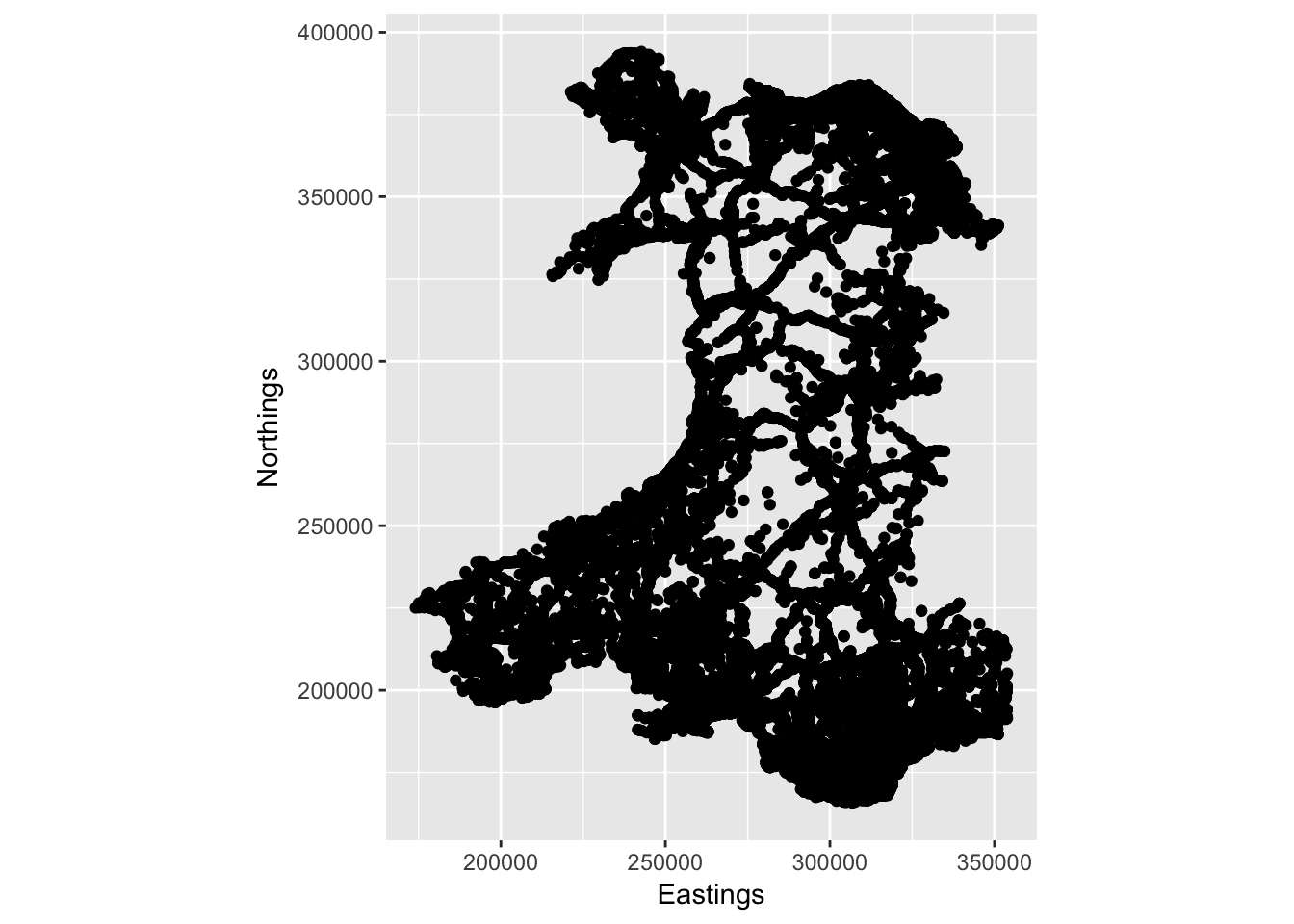
# join road data to previous table
injury.rates <- left_join(injury.rates, welsh.roads)

# load swansea area
swansea.lsoa <- readOGR(dsn = "./swansea.lsoa.2011.shp", layer = "swansea.lsoa.2011", p4s = bng)
swansea.lsoa@data <- plyr::rename(swansea.lsoa@data, c(LSOA11CD = "code"))

# fortify
swansea.lsoa.fortify <- fortify(swansea.lsoa, region = "code")
Join injury rates and visualise in Swansea map
# join injury rates to new geometry
plot.data <- left_join(swansea.lsoa.fortify, injury.rates)

# Map the injury rates
ggplot() + geom_polygon(data = plot.data, aes(x = long, y = lat, group = group,
fill = n_accidents), colour = "grey", size = 0) + coord_equal() + xlab("Eastings") + ylab("Northings")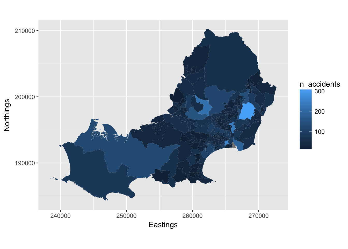
# Filter severity fields from imported 'Stats19.final' file
Severity <- Stats19.final
Severity <- subset(Stats19.final, select=c("Accident_Severity", "id"))

# Cast rows to columns so we have a col for each Severity level
Severity.casted <- melt(Severity)

# Count all severity types accidents, per type - columns Sev 1, 2 and 3
Severity.casted <- mutate(Severity.casted, Sev1 = ifelse(value == 1, 1, 0))
Severity.casted <- mutate(Severity.casted, Sev2 = ifelse(value == 2, 1, 0))
Severity.casted <- mutate(Severity.casted, Sev3 = ifelse(value == 3, 1, 0))

# Group by and summarise each severity by Swansea lsoa locality(id) prior to joining
Severity.counts <- Severity.casted  %>% group_by(id) %>% summarise(count_Sev1 = sum(Sev1), count_Sev2 = sum(Sev2), count_Sev3 = sum(Sev3))

# Join severity to injury rates (plot.data)
Severity.rates <- dplyr::left_join(plot.data, Severity.counts)

# Calculate basic rates on n.accident over total road Km
Severity.rates$road.rate <- Severity.rates$n_accidents/Severity.rates$Total_km

# map basic rates rates to show spatial distribution in Swansea
ggplot() + geom_polygon(data = Severity.rates, aes(x = long, y = lat, group = group,
fill = road.rate), colour ="grey", size = 0) + coord_equal() + xlab("Eastings") +
ylab("Northings")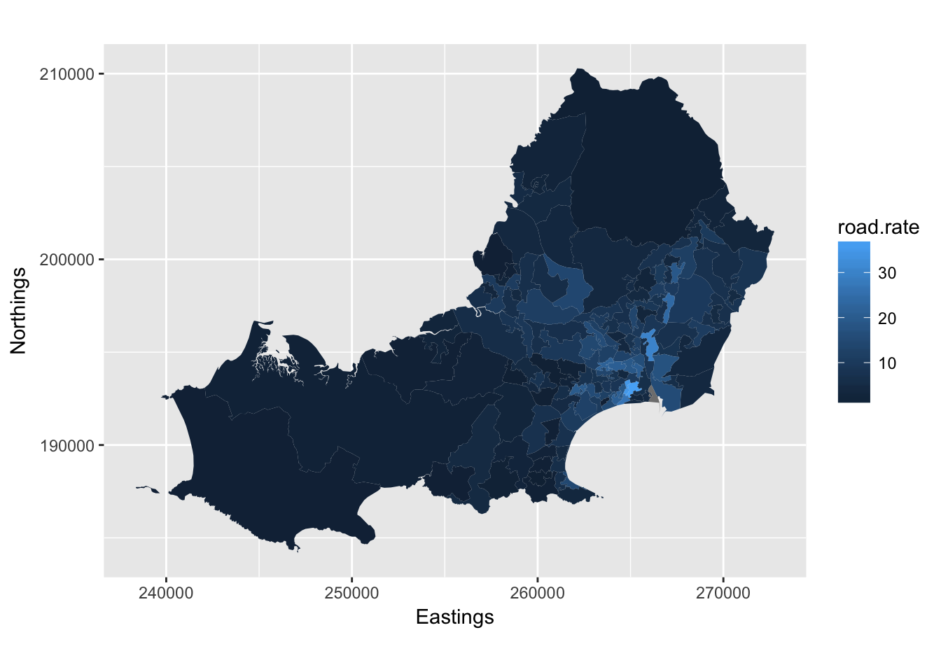
Replace NA values with 0 to avoid NA showing on map
# change incomplete to NA
is.na(Severity.rates) <- sapply(Severity.rates, is.infinite)
# zero out NA
Severity.rates[is.na(Severity.rates)] <- 0
Calculate adjusted rates for severity type 1 accidents by km of road and show on final map
#Create refined rates for Severity 1 (fatal) using basic rate
Severity.rates$Sev1_rate <- Severity.rates$count_Sev1/(Severity.rates$n_accidents * Severity.rates$road.rate)

# Map the refined rates for Severity 1 (fatal)
ggplot() + geom_polygon(data = Severity.rates, aes(x = long, y = lat, group = group,
fill = Sev1_rate), colour = "grey", size = 0) + coord_equal() + xlab("Eastings") +
ylab("Northings")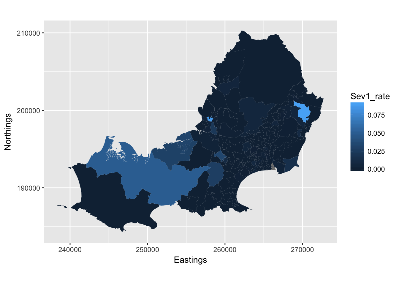
#Quintile for Severity 1 Rate - final map for poster
Severity.rates$Sev1_q <- cut(Severity.rates$road.rate, 5, labels = c("1", "2", "3", "4", "5"))

ggplot() + geom_polygon(data = Severity.rates, aes(x = long, y = lat, group = group, fill = Sev1_q), colour = "grey", size = 0) + scale_fill_brewer(type = "seq", palette = "Blues") + coord_equal() + xlab("Eastings") + ylab("Northings")
The above map was used on final poster